A&H

Penalties and Expected Penalties in English Premier League

elindio

New Member
There is an interesting discussion on penalties being awarded and given against for English and non-English players in the Premier League.

It seems there is a trend which aligns with nationality that results in more or less penalties being awarded. The table illustrated is this: Tableau Link

The nationality trend also provides this insight.
Penalties-Won-vs-Expected-Penalties-768x791.png
Is this something that also conforms to the views of all you when you look at matches played in England?

Also, are there specific trainings to coach referees about avoiding biases?

Rest of the article: Link
 
The Referee Store
Stats can be very misleading. They can be manipulated and make them appear what they want as part of their agenda. For example in this case the whole thing is based on a 'man made' calculated number for "expected penalties". They can use different factors to calculated that to suite their agenda.
 
An interesting table that suggest this may be worthy of further investigation, but two immeadiate thoughts spring to mind that could improve this work:

1.) To create the metric “expected penalties“ what they’ve done is they’ve taken 10 players (all English) and compared the number of touches of the ball in the penalty area with the number of penalties awarded. This creates a formula: for every x touches of the ball in the area you would expect to be awarded a penalty. This is called linear regression and is a valid method for this sort of work ...

... But. And here is the big but, they should have used a much bigger data set to create the model, either by using all the players, and then seeing where nations against that regression line, or taking (say) a third of the data, using it as “training data” to come up with the model, and then comparing the remaining two thirds with this (and seeing how the nations faired)

2) Getting a little more sophisticated, they should strip out those touches in the area that lead to a goal* as you would not expect these touches to lead to a penalty. As I read through the article, it became apparent that the author had, perhaps, touched on this by accident: he noted that the most dangerous players (those who scored the most goals) were not the most likely to get a penalt.

I might get in touch with the author to see if he’ll share his data, and I can apply my thoughts to it. He could be on to something, but at the moment I think it’s potentially statistically flawed.

*Reminds of the infamous study on bombers returning to base in World War II. They looked at where all the holes were on the planes that came home, after being through flak and fighter attack. Some areas had (statistically) more holes than other places on the planes, and they decided that this is were they should add extra armour, as this is where the planes were most likely to be hit. ... Until some bright spark realised that it was the areas with least holes that needed strengthening with extra armour - they weren’t seeing many holes in these places because if a plane got hit there, it wasn’t going to make it back to base.
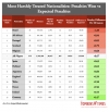
 
That well known perception that German and Argentine players are less likely to dive...

Any chance this study originated in Portugese speaking country?
 
An interesting table that suggest this may be worthy of further investigation, but two immeadiate thoughts spring to mind that could improve this work:

1.) To create the metric “expected penalties“ what they’ve done is they’ve taken 10 players (all English) and compared the number of touches of the ball in the penalty area with the number of penalties awarded. This creates a formula: for every x touches of the ball in the area you would expect to be awarded a penalty. This is called linear regression and is a valid method for this sort of work ...

... But. And here is the big but, they should have used a much bigger data set to create the model, either by using all the players, and then seeing where nations against that regression line, or taking (say) a third of the data, using it as “training data” to come up with the model, and then comparing the remaining two thirds with this (and seeing how the nations faired)

2) Getting a little more sophisticated, they should strip out those touches in the area that lead to a goal* as you would not expect these touches to lead to a penalty. As I read through the article, it became apparent that the author had, perhaps, touched on this by accident: he noted that the most dangerous players (those who scored the most goals) were not the most likely to get a penalt.

I might get in touch with the author to see if he’ll share his data, and I can apply my thoughts to it. He could be on to something, but at the moment I think it’s potentially statistically flawed.

*Reminds of the infamous study on bombers returning to base in World War II. They looked at where all the holes were on the planes that came home, after being through flak and fighter attack. Some areas had (statistically) more holes than other places on the planes, and they decided that this is were they should add extra armour, as this is where the planes were most likely to be hit. ... Until some bright spark realised that it was the areas with least holes that needed strengthening with extra armour - they weren’t seeing many holes in these places because if a plane got hit there, it wasn’t going to make it back to base.
A few things that also spring to mind for me;
Is the Author 'looking' for a particular conclusion and therefore inclined to confirmation bias in his methods
Also, what about 'probability having no memory'. By that I mean, he could run the same observations again and get opposing data. Like you indicated, the statistical chance of this is down to 'the law of big numbers' and the fact that they used only 10 players for sampling suggests the study is weak
Increasingly, TV is spouting all sorts of statistics at us, stats that are merely coincidental and used to make us think that a pattern really exists. The vast majority of the time, these stats are utter nonsense. We need metrics from very large datasets before the numbers have any relevance. Points gained and goal-difference over an entire season being a good example of minimums
I'm preaching to the wrong person (of course) and merely echoing what you've already indicated!!!!
 
A few things that also spring to mind for me;
Is the Author 'looking' for a particular conclusion and therefore inclined to confirmation bias in his methods
Is the correct answer.

Yet another set of stats someone has cobbled together in the hope that somebody will be able to proclaim the "R" word. :rolleyes:
 
A few things that also spring to mind for me;
Is the Author 'looking' for a particular conclusion and therefore inclined to confirmation bias in his methods
Also, what about 'probability having no memory'. By that I mean, he could run the same observations again and get opposing data. Like you indicated, the statistical chance of this is down to 'the law of big numbers' and the fact that they used only 10 players for sampling suggests the study is weak
Increasingly, TV is spouting all sorts of statistics at us, stats that are merely coincidental and used to make us think that a pattern really exists. The vast majority of the time, these stats are utter nonsense. We need metrics from very large datasets before the numbers have any relevance. Points gained and goal-difference over an entire season being a good example of minimums
I'm preaching to the wrong person (of course) and merely echoing what you've already indicated!!!!

I don't think the sample of 10 is that important. The sample of 10, as I understand it, was only used to determine how many touches in the PA = a PK. That number going up or down wouldn't change the rankings, just the size of the number associated with the ratings.

The bigger question to me is whether touches in the PA really correlates with "expected PKs" in the first place. Style of play can radically affect whether those touches are likely to create PKs--if I;m the guy who gets in the PA with the intent to cross the ball, I'm going to get far fewer PKs than the guy who always tries to dribble through defenders in the PA.. I suppose the "study" assumes that balances out in the sample size of players looked at (976). But I'm more than a bit skeptical. (Indeed, if this is intended to demonstrate bias (which the title certainly implies), we really have refs in the heat of the moment distinguishing between the Scots and the Englishman and between the Spanish and the Portuguese?)
 
Another 'stats' that can have an impact is player position. For obvious reasons, forwards are much more likely to get penalties that defenders do, and midfielders somewhere in the middle (pun not intended). For the stats in OP to be position nutural, the number of players from a certain country should be comparitively balanced in positions. For example if one country has majority defenders, it is expected they would get less penalties.

I am puzzled why we even need the "expected penalties" calculated that way? Why not just use the average penalties for all players as the benchmark and see where every country sits compared to that benchmark (possibly subdivided to three sets of forwards, midfields and defenders).
 
I don't think the sample of 10 is that important. The sample of 10, as I understand it, was only used to determine how many touches in the PA = a PK. That number going up or down wouldn't change the rankings, just the size of the number associated with the ratings.

The bigger question to me is whether touches in the PA really correlates with "expected PKs" in the first place. Style of play can radically affect whether those touches are likely to create PKs--if I;m the guy who gets in the PA with the intent to cross the ball, I'm going to get far fewer PKs than the guy who always tries to dribble through defenders in the PA.. I suppose the "study" assumes that balances out in the sample size of players looked at (976). But I'm more than a bit skeptical. (Indeed, if this is intended to demonstrate bias (which the title certainly implies), we really have refs in the heat of the moment distinguishing between the Scots and the Englishman and between the Spanish and the Portuguese?)
I think the article is looking for bias, so it'll inevitably find what it's looking for. Otherwise it wouldn't be published
Hope none of the 10 played for Newcastle, because our touches in the oppo PA merely serve to put the ball into row Z
 
I am puzzled why we even need the "expected penalties" calculated that way? Why not just use the average penalties for all players as the benchmark and see where every country sits compared to that benchmark (possibly subdivided to three sets of forwards, midfields and defenders).
I don't think that metric is completely nuts--you can't get fouled for a PK unless you are in the PA, and most PK calls are against the player with the ball. So I would think touches in the PA would correlate better than minutes played, even after controlling for position. but "better" does not necessarily mean "well." Really this study isn't about PKs vs expected PKs, but PKs vs touches in the PA.
 
I'd venture a guess that the centre backs for Sam Allardyce style teams get more touches in the opposition penalty area than the majority of their team mates.
 
I don't think the sample of 10 is that important. The sample of 10, as I understand it, was only used to determine how many touches in the PA = a PK. That number going up or down wouldn't change the rankings, just the size of the number associated with the ratings.
I think it does matter.

Essentially what they have done is plotted 10 points on a scatter graph, drawn a line of best fit, and used the equation of a straight line (y= Mx + c) to come up with an equation for expected penalties. This is from a data set of circa 1,000, so if you pick a different 10 players you will get a different straight line, hence a different equation and so the ranking may be different.

The fact that every country has a negative expectation suggests that the model isn’t right - I would have expected some countries to be above expected, some below. There will always be errors, what he now needs to do is test whether those errors are what would be expected statistically (random), or not in which case they would they would begin to support his hypothesis.

A good idea, but could have been more rigorousLy executed.
 
I think it does matter.

Essentially what they have done is plotted 10 points on a scatter graph, drawn a line of best fit, and used the equation of a straight line (y= Mx + c) to come up with an equation for expected penalties. This is from a data set of circa 1,000, so if you pick a different 10 players you will get a different straight line, hence a different equation and so the ranking may be different.
No, the ranking wouldn't be different. The 10 were used to set the baseline number of touches to equal a PK (which isn't shared, at least in the chart). So let's assume that their study of 10 came up with a PK every 10 touches. That gives the chart. Let's assume a more detailed study came up with a PK every 20 touches. That would change the difference in expected, but it would change it the same amount for every team. So most teams would show as getting more PKs that expected--but the ranking order would be exactly the same. (And why, oh why, wouldn't they just use the "all players" as the data point for determining expected instead of a random sample of 10??? Because that's the only way to get a result over 1 "lost" PK per 38 games??)

Of course, even ignoring that, the "per 38 games" makes the difference look bigger than it is, too. Less than one more expected PK per 38 games separates Brazil as the outlier from Germany at the other end--or .021 PKs/game. And if you take out the two extremes and look at the second best/worst, you have .29 PKs difference per 38 games, or .0076 PKs per game.

I didn't read the article--looks like nothing more than click bait to me.
 
I don't think that metric is completely nuts--you can't get fouled for a PK unless you are in the PA, and most PK calls are against the player with the ball. So I would think touches in the PA would correlate better than minutes played, even after controlling for position. but "better" does not necessarily mean "well." Really this study isn't about PKs vs expected PKs, but PKs vs touches in the PA.
I am not questioning its relevance. I am questioning the complexity compared to what I suggested and if any gain is made by making it that complex.
 
Back
Top